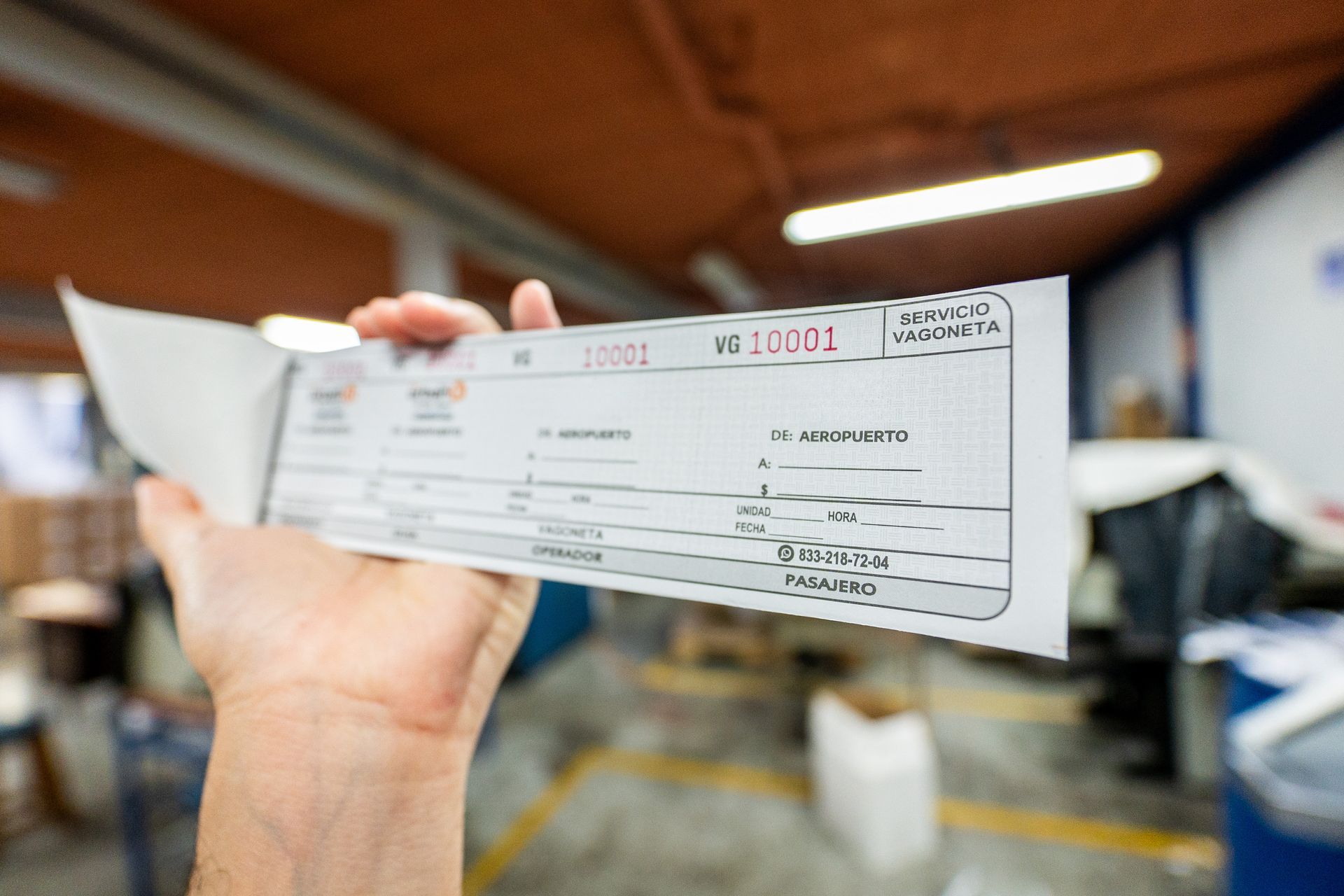
SEO and mobile devices
Learn about the importance of having your website optimized correctly for mobile devices. Discover the impact that good mobile design has on brand positioning.

SEO and mobile devices
Website visits from mobile devices account for 20% to 40% of the total traffic we receive. To this day, visits from mobile devices have increased considerably and may surpass desktop visits in a short time.
Moreover, both the search results as well as our website look different on these devices. Because of this, it is crucial to build a website that provides a good experience to users who visit us from their phones or tablets.
Having a responsive website is more than necessary, both to provide a good user experience and to remain competitive in terms of SEO.
The importance of optimizing our website for mobiles
From screen size to button and effect operation, a mobile website is different from the desktop version.
Our website must be prepared to be easy to navigate, load quickly and have adequate visuals.
Having a “responsive” or adaptable design means paying attention to the details of our website, in order to adapt its design to the specific needs of a large number of users.
If a website is difficult to navigate with very small texts and images cut in half, surely the user will stay very little in it. Additionally, search engines have valued this quality to the point of asking web designers to make adaptable websites.
The increase in mobile use
Every year the daily usage time of mobile devices is increasing. The numbers don't lie, currently 7 out of 10 people connect daily from their cell phone for more than thirty minutes.
And even more incredible is that 90% of users connect every or almost every day to the internet from their cell phone. This is because telephonic functions are being replaced by instant messaging applications.
Cell phone usage has grown and changed in such a way that even banks have moved their operations to apps, with most of these being done online. This way, the use of mobile devices has become from a novelty article to a reliable tool.
Mobile devices are becoming the only way to navigate the web, connect with other people, make online purchases and even banking transactions. Such a relevant part of the web cannot be ignored by our SEO strategy.
Benefits for SEO
The greater the range of devices that can comfortably access your site, the greater the traffic to your website. This will help you increase your conversion rate, as a mobile-friendly site inspires user confidence.
On the other hand, you can save time and money by optimizing your mobile version. This is because the URL is the same for both versions and the content for SEO will only have to be optimized once.
Another advantage of adapting your content for mobile devices is that they are more accurate with the location and information of the user's origin. In this way you will be able to show different contents based on this information and access a functionality that was only available recently for large companies.
Mobile content
From diversifying content by user origin and location to creating a separate mobile version of your blog, the mobile content may be the same but its design and configuration isn't.
One advantage of having a special blog for mobile devices is the improved loading times and reduced mobile data usage.
Remember that a desktop version weighs more, so it can be an inconvenience to users who use mobile data to browse the network. Something as simple as the size of images and other elements can be optimized to improve the user experience.
Remember to target the most important content at the top of the page, in this way the user can access the most interesting information without being distracted by other elements.
Importance of the contact page
Having a well-configured contact page is very important. We need to include our information as clearly as possible, with a legible size. The format can become important as well.
Due to the multifunctionality of mobile devices, information such as our address or phone number can be used in other applications immediately. That's why we need to check if our address is visible from apps like Google Maps, which will also help us to achieve an effective geopositioning.
Buttons to redirect to mail applications, instant messaging and the cell phone call function are very useful in this mode. Try to use the right sizes and take advantage of the opportunities a mobile design has for you.
What would happen if I don't adapt my website for mobile devices?
Apart from losing the opportunity to get all the benefits of a responsive website, not making any changes will take you a lot of unnecessary risks. From losing community and decreasing your web traffic, an unfriendly site affects subscription rates.
The first impression of your website is very important. A site that takes time to load, with images cut in half, confusing effects and very small print will make you lose potential readers and give you an unreliable reputation.
Blog posts are largely consumed by mobile phone users. Losing traffic on your Blog will mean a waste of good content and an underutilized area in terms of SEO.
Finally, not optimizing links and subscription forms for use on mobile devices will frustrate any user who has trouble entering their data. All these hassles would deter anyone from subscribing to your email list.
Comparte
Blog para Negocios

